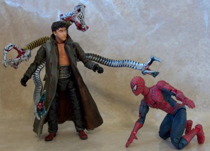
Spider-man Classic villians
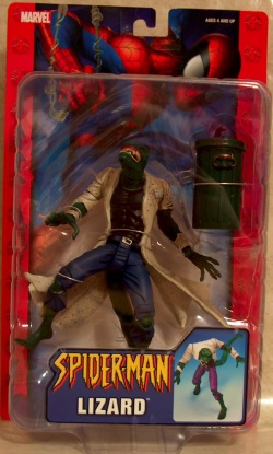
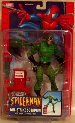
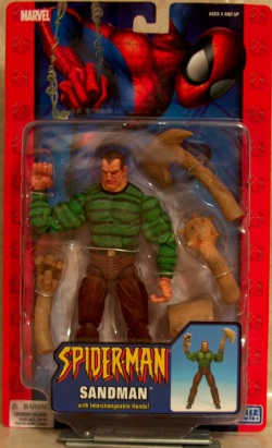
|
While Toy Biz's Marvel Legends line has been getting the attention of a great many Marvel true believers, meanwhile its predecessor, the
Spider-man Classic line, has been dutifully churning out wave after wave of Spidey figures for the kids. But mixed in with all of those
plastic wall-crawlers Toy Biz has been producing a steady trickle of Spider-man villains. So now I thought I would take a look at some of
the villain offerings from the last six months including Tail-Strike Scorpion, Lizard, Tail Attack Lizard, Sandman and one of the Spider-man
2 movie Doc Ock figures, plus the obligatory Spidery variant in the form of Manga Spider-man.
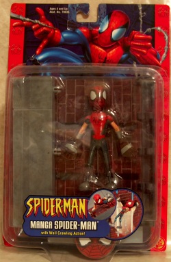
Packaging - 7/10The Spider-man Classic figures have stuck with the traditional blister card packaging with a design that is bright and attractive. Each figure is displayed in the center of the bubble with the accessories packaged either behind or along side the figure. For figures such as Scorpion, Sandman and Doc Ock it works well. But for figures like Manga Spider-man and to a lesser extent, Tail Attack Lizard who have extremely large accessories that have to be shipped in pieces to fit in the packaging, it can be difficult to see exactly what you are getting except for the small photo next to the name on the bubble. The cards for most of the figures use a bright red stripe with spider symbols on them along each side of the cards to add color while an illustration of Spidey swinging into action adorns the top of the card. Since Doc Ock is part of the movie line, his card has just a single black stripe along the right side with the movie title while a CGI Spider-man crouches along the top of the card against the golden hued cityscape background. The card backs leave some room for improvement though. Each figure has a unique card back with a small paragraph about Spider-man, instructions for the figures' accessories and action features and photos of the other figures in the wave. While functional, it doesn't seem like the cards fail to effectively highlight the figure. Partly this is due to space constraints I'm sure, but replacing the generic paragraph about Spider-man with character specific info or a bio would be a step in the right direction. Or the illustrations for the instructions could be replaced with actual photos of the product.
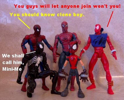
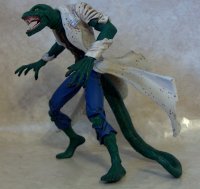
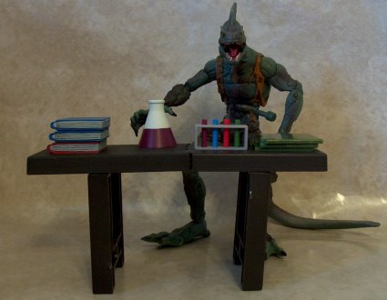
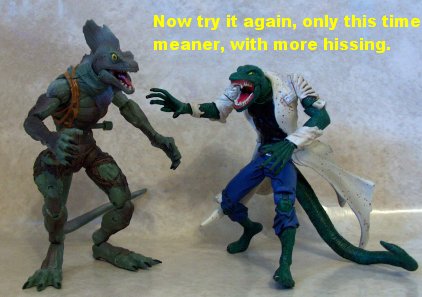
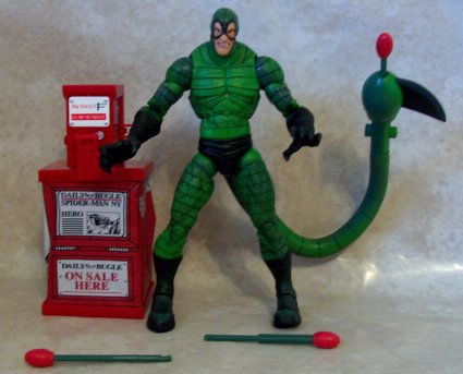
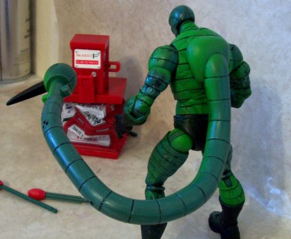
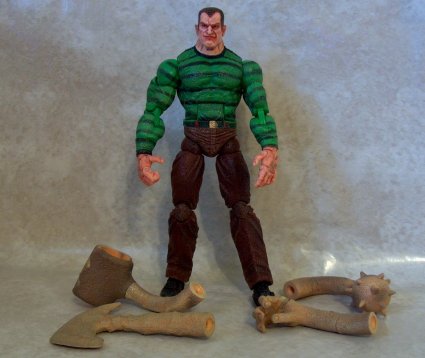
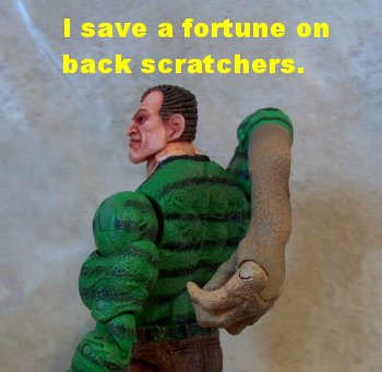
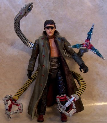
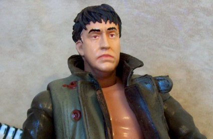
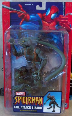
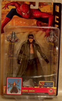
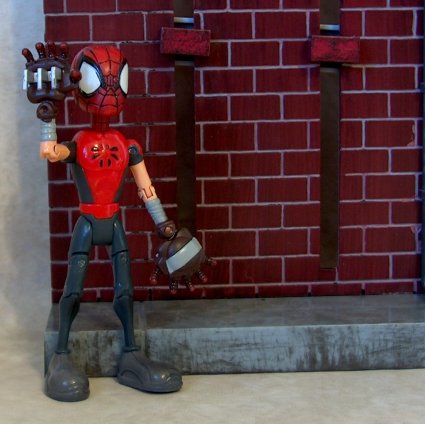
Sculpting - Manga Spider-man, TA Lizard 4/10, Lizard 6/10, Scorpion, Doc Ock 8/10, Sandman 9/10Manga Spider-man has a very simple sculpt that seems to emphasizes clean lines over detail. I am guessing that this was done to match the artwork of the comic books, but since I've never seen said book, I really don't know. But on model or not, the sculpting has two significant pitfalls, the hands and head. The palms of the hands are quite large, a trait that is probably very much on model for a Japanese inspired "manga" version, but the individual fingers remain more or less in scale with the body of the figure and thus woefully tiny compared to the hands. The head sculpt is well don as well, but doesn't match the rest of the figure style wise. The etched web lines in particular make it look like this head came from some other figure.The Lizard figure is remarkably well done, especially when you look at the copyright date on the foot and realize that this is an eight year old sculpt! But despite its age, the sculpt suffers from only one real problem; it's too small. This sculpt of the Lizard was done back when Toy Biz's Marvel figures were all in a 5" scale. They have since moved up a larger, 6" scale. The extra inch may not seem like much, but it is sufficient to transform what would have been a fairly large, muscular figure into a very slim one. Tail Attack Lizard is the Marvel Ultimate Universe version of the lizard. I've yet to see a good image of what the Ultimate Lizard is supposed to look like so I don't know if the sculpt even comes close to the comics. Save for the shredded pants and the last scraps of what was once a shirt, almost all of TA Lizard's detail comes from the texture of the skin and Toy Biz did a great job on that. Unfortunately, this version of the Lizard seems to have been stabbed by the action feature fairy. There is a very noticeable button that sticks out from the left side of his ribs to activate the action feature. This is probably the worst executed action feature button I have seen in ages, if not ever. With so many examples of companies doing a great job of incorporating buttons for action features into the sculpts, this is just ridiculous. It is as if Toy Biz didn't even bother to try. The good news is that it is an easy fix, even for non-customizers. On quick cut with a knife or even some good scissors should do it. Mac Gargan has never looked so good. Toy Biz did a great job of retaining a classic look without it looking corny, quite a feat with a screwball in a green striped bodysuit. The addition of small rivets under each of the stripes is unnecessary, but not overly distracting. The only thing I am not entirely happy with is the end of his tail. Toy Biz went with the shooting, spiked look from Scorpion's latter designs. But the spike seems far too big, it could practically be used as a scythe. Secondly, they didn't bother to try and incorporate the button for the action feature here any better than on Tail Attack Lizard. Actually it may be slightly worse. Since the button is on the narrow part of the tail, there must not have been enough room internally for the release mechanism, so they put a second protrusion on the other side of the tail making it look like there are two buttons. There is a long standing, and not entirely unfounded belief among action figure makers that regular human figures don't sell well. So it is quite surprising that Toy Biz went ahead and produced a figure of him that is more or less a normal guy in horribly outdated clothes. Toy Biz did hedge their bets slightly though. All of Sandman's clothed areas (shirt, pants and even his shoes) were given a very unique texture that I guess is meant to represent sand but really just seems like an incredible case of chicken pox. The effect isn't canon; the images I've seen of Sandman all show perfectly formed clothing. But the texture does have another interesting effect, mimicking the uneven printing of the original comics to produce a figure that really looks like it could have stepped off of the pages of an early Spider-man book. Sculpting a figure of a real person is a bit like dancing the hokey pokey over a bear trap; both tend to be painful experiences with potential for some truly ugly results. A lifetime of learning to distinguish faces means that most people can tell in a second when a sculpt doesn't quite match the original subject, even when they aren't able to explain why. Fortunately, Toy Biz's second version of Doctor Octavius from the second Spider-man movie is nowhere near the train wreck that some figures have been. (Yes monkey face Leia, we are talking about you!) In fact, the only area that I find disappointing on this figure is the mechanical arms and claws, and that is more the result of the limitation of the materials used than Toy Biz's efforts. Since the arms themselves are bendable, rubbery material, they don't have the kind of hard edges that you would expect of what is supposed to be a metallic construction. But since the only way to overcome this would have been to produce the arms in something like thirty five different plastic pieces (or in a dream world, die cast metal), the compromise is no surprise. But the same needn't be said for the claws on the end of each arm which were made of a stiffer plastic but still lack the crisp detail that is present on the rest of the figure. It is actually hard to tell that they aren't still part of the rubbery sections of the tentacle arms. The only other disappointment about the figure is the bare chest. Granted, during the lab scenes Doctor Octavius was usually shirtless, but he did have a shirt on when he was wearing the overcoat. But I guess this is one of those things that just has to be chalked up to the long development time involved with the current action figure creation process. The figure was probably produced based on the same early promotional shots most of us saw with a shirtless Doc.
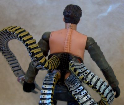
Paint - Manga Spidey 3/10, Doc Ock 5/10, Lizard & Tail Attack Lizard 8/10, Scorpion & SandMan 9/10,Manga Spider-man takes another hit due to a complete lack of consistency. His legs have a great shading effect to add depth and shadow. But then they are connected to the glossy simplistic chest. And when the head with its heavy black paint wash is added, the figure begins to look more like a frankensteined custom than a commercially produced figure. Throw in some sloppy work on the grey for his wrist wrapping and climbing claws and you can see that the paint department was not kind to Manga Spider-man. Fortunately the problems suffered by this earlier figure didn't persist with Toy Biz's later offerings.The paint apps on the Lizard figure do an amazing job of bringing out the detail in the older sculpt and really sell the figure. Unfortunately there are a couple of sloppy spots. Most notably, my figure has a dab of white paint on one of his feet. But there is also some sloppiness at the edges between the lab coat and arms or chest and with the belt and belt loops of the pants. None of this is a major drawback, it just doesn't do as much as it could to bring out the details of the sculpt. Tail Attack Lizard would probably have scored better than his predecessor except that my figure seems to have been stabbed in the eye with a mascara brush. On such an important feature, a minor flaw becomes a much bigger problem. But the figure also has some serious problems with the paint wearing off of the cut in the hip joints resulting in an odd looking green stripe. Scorpion has a near flawless paint job, but only near flawless. There were a couple of black paint drips on my figure, most of which were easily removed with a finger. And there is also a noticeable difference in the shadowing between the bendable portion of the tail and the end of it. Sandman looks great, only ridiculous nitpicking kept him from getting a perfect ten. The head in particular is amazing. The execution for the rows of hair and the shading in the furrows of the face just seem to scream comic book art to me. My nitpick is with the breaks caused by the articulation, the neck joint and shoulders in particular. The joint in the neck isn't painted which makes it slightly off in color from the rest of the skin tone. The paint on the shoulder joints of my figure all came off immediately, though quite cleanly at least. While the plastic underneath matches the paint better than the neck, it still breaks up the flow of the figure though since the black stripes of the shirt don't continue across the joints. There is also some inconsistency in the black stripes for the shirt which can vary from solid black to faded to almost non-existent in some areas. However, I didn't hold it against the score as I think it adds to the aged look of the figure. I've always though a good paint job should be able to add to the visual appeal of a sculpt, after all a bad one will certainly hurt it. Doc Ock is an example of a middle of the road paint job that can't quite do either. The tentacles have what is easily the worst paint work on the entire figure. The yellow paint used on one side of each tentacle seems to have been really slopped on and the silver isn't much better. The claws don't fair any better. The silver for the exteriors is as bad as the tentacles while the interiors seem to have received random sprays of red and blue paint. The figure itself is nicely painted, though sparsely. And the coat turned out extremely well too. Both the exterior and interior received washes to add depth and shadow with wonderful results. Though I should also not that mine seems to have been handled too soon after painting as the wash is smudged in one spot of the interior. Two other things to note about the paint work; the pegs for the elbows are not painted and don't match the surrounding paint well and the metal spine that attached the arms to Doc Ock's brain in the movie is sculpted on the figure, but left unpainted since it is completely covered by the coat.
Articulation - Lizard 4/10, Manga Spider-man 6/10, others 9/10The Spider-man Classic line was the predecessor to the Marvel Legends line so it isn't surprising that it has done an admirable job of keeping pace with it as far as articulation. Most of these figures have most of the following articulation:
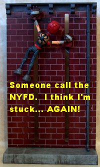
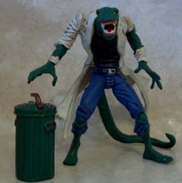
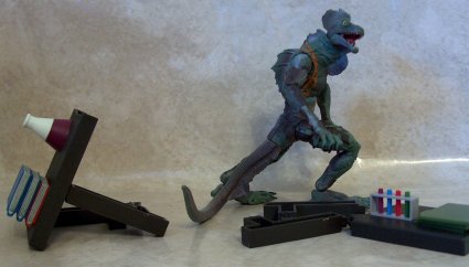
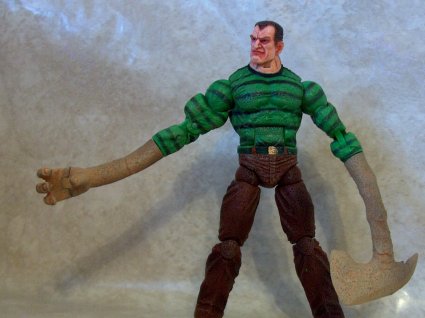
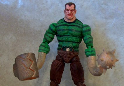
Accessories - Doc Ock 0/10, Lizard 2/10, Tail Attack Lizard, Manga Spidey 5/10, Sandman 7/10, Scorpion 8/10,Doc Ock has just one accessory, a removable pair of sunglasses. But due to the soft plastic used to prevent breakage and its inability to hold fine mold details plus the unpainted frame, they are better left off the figure. (Actually they are better disposed of permanently.) Lizard comes with a garbage can and lid. There's no real point to the garbage can as an accessory other than to serve as a reminder that this is actually a five inch figure and out of scale with the rest of the line. (But I guess I can use it to throw away Doc Ock's sunglasses.) Tail Attack Lizard comes with a lab table to destroy. It is a nice idea but underwhelming in execution. There are some folders, test tubes, books and a flask on top of the table but all of them are very simplistically painted, so much so that it seems out of place with the figures. And it doesn�t have any means of holding the parts together securely for display. Plus, how many times do you want to destroy the same table? Manga Spider-man comes with a wall to climb up. It does make a reasonable display piece but is fairly small, only just about a single story for a six inch scale figure. Sandman comes with four replacement limbs: a sand hand with articulated fingers, an axe, a spiked ball and a grasping claw. Any of the four can attach to either arm at the forearm joint. While a nice idea, the sculpting of each could be improved. To start with, none of the parts actually has any sort of transition between the shirt sleeve and the sand. All four have slightly odd bends to them that makes creating a natural pose difficult. I also don't quite understand why the sand hand has only three fingers??? Scorpion has the most original accessory, a collapsible newspaper box and three projectiles to fire from his tail. When the white plate on the front of the coin box is pressed, the lower section collapses. The sides of the lower section are soft, thin vinyl to create the crushed effect. It is a neat idea and works reasonably well. It would be nice if it could be flattened a little more. The graphics on the box are also very out of character. The left side has a large black and whit graphic of Spidey with "Spider-man NY Hero" printed across it, as does the headline of the paper in the front "window." Since the Daily Bugle's attacks against Spider-man have been a constant for decades across the comics, cartoons and the movies. It is sort of sad that Toy Biz lacked enough faith in the kids of the world to believe they would understand such a reference.
Action Feature - Manga Spider-man 3/10, Tail Attack Lizard 4/10, Sandman 6/10, Scorpion 10/10, Lizard & Doc Oct NANeither the Lizard nor Doc Oct figure have any action feature since neither was designed originally to be a part of this line. Sandman's only action feature is the interchangeable limbs, simple and appropriate to the character. Tail Attack Lizard has a tail attack feature, big surprise! When the button on its side is pressed the tail rotates. It is a decent feature. But it does limit the use of the tail articulation plus you get the button stuck in the figure's side. Manga Spider-man can attach the hooks on his hands to two bricks on the wall which can be raised or lowered from the back of the wall. An appropriate feature but not terribly impressive, and between the claws sculpted onto the hands and the articulation added just for this feature and it seems like the entire figure is designed around the action feature. I believe it should be the other way around. This is where Scorpion comes in. He has two action features, both of which make sense and neither of which seriously detract from the figure. The first feature is the collapsing paper box already described in the accessory section. The other action feature is the spring loaded projectile firing tail. Any of the three projectiles included can be plugged into the tail and fired by pressing the button on the tail.
Value - Lizard & Manga Spider-man 4/10, Tail Attack Lizard 7/10, Others 8/10The regular retail for Spider-man Classic figures is between $8 and $9. Manga Spider-man probably won't seem worth the price to most people. Still, this is probably the only version of the character that we are likely to see; it does have certain inherent value for that reason alone. And if you can find it on clearance, it is worth picking up. The Lizard is rehash of an eight year old figure. It doesn't quite measure up to current standards. At best it is a mediocre stand-in until a real Lizard figure is produced. The other figures are all solid additions to SMC's ever growing rogues gallery.
Happy Hunting:I have been accumulating the figures for this review for some time, quite a long time actually. As a result, some of these figures are going to be tougher to track down. Manga Spidey is actually the oldest of the six. But since the figure didn't sell very well he should still be easy to track down. Tail Attack Lizard is going to be the toughest to find as it was short packed about three waves ago. Scorpion was the short packed villain from the last wave and Sandman from the currently shipping wave. But both have been showing up regularly. Lizard is part of the new wave of villain refresher cases that have just started shipping which I found at Toys R Us. Doc Ock was part of the final wave of movie figures that is still lingering on pegs from place to place.
|
|
